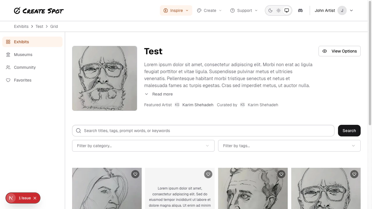
In Grid view, an exhibit’s pieces are shown in a grid of thumbnails or cards. You scroll to see more and click to open a piece in detail.Documentation Index
Fetch the complete documentation index at: https://help.create.spot/llms.txt
Use this file to discover all available pages before exploring further.
How it works
- Layout — Pieces appear in rows and columns. The grid may be responsive (fewer columns on small screens, more on large).
- Each cell usually shows one submission: image (if any), title or caption, and sometimes the creator’s name or a link to their profile.
- Click or tap a piece to open it in a lightbox or on a detail page. From there you can view full size, see the creator, and sometimes leave feedback.
Scrolling and loading
- As you scroll down, more pieces may load (infinite scroll) or you may see “Next page” / pagination. Behavior depends on app design.
- Use the grid to quickly compare many pieces and jump to the ones that interest you.